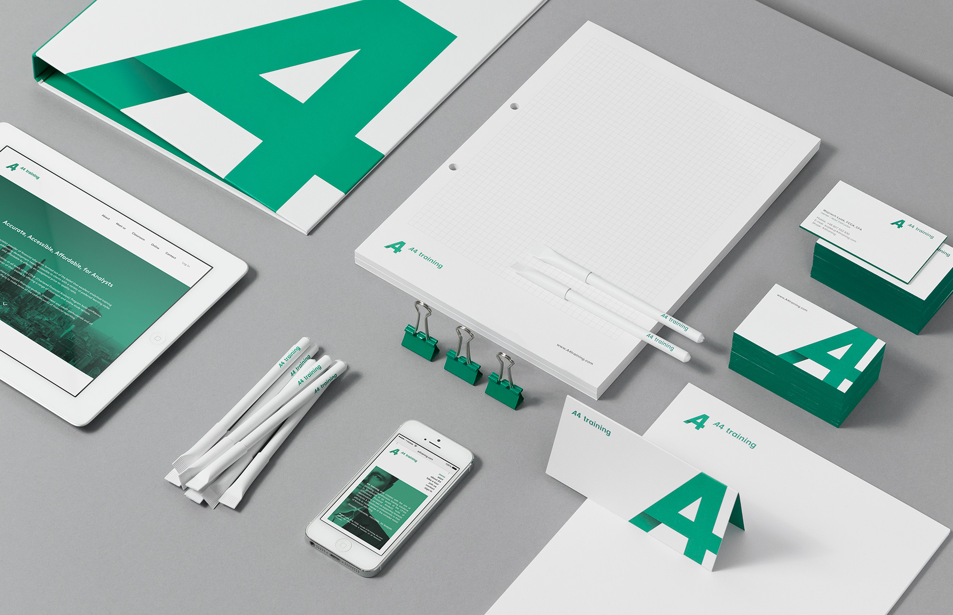
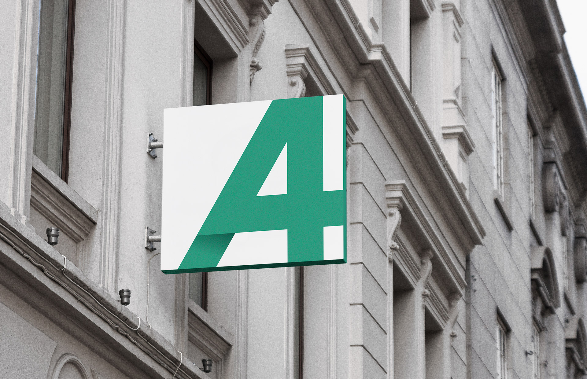
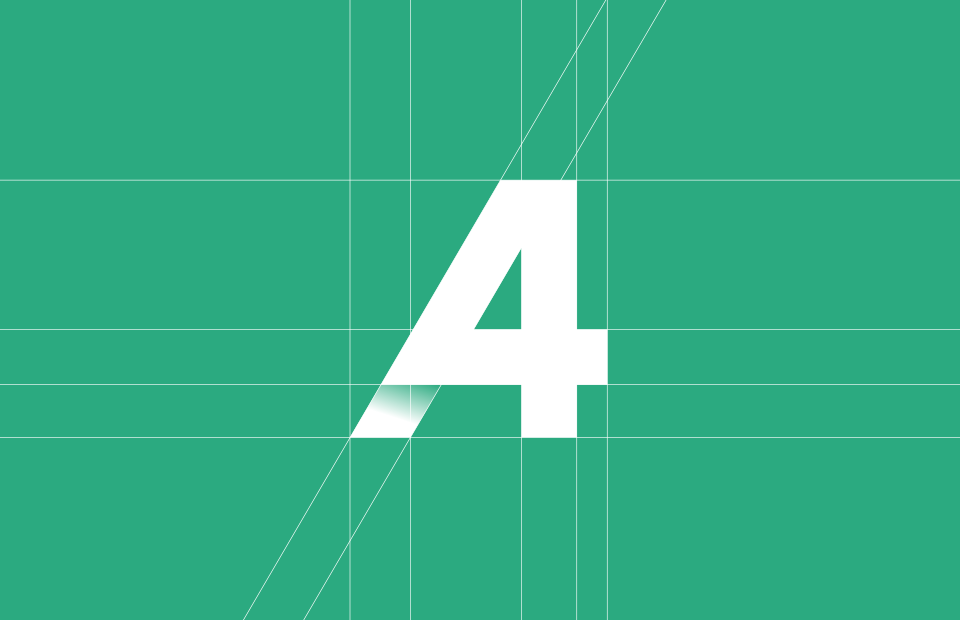
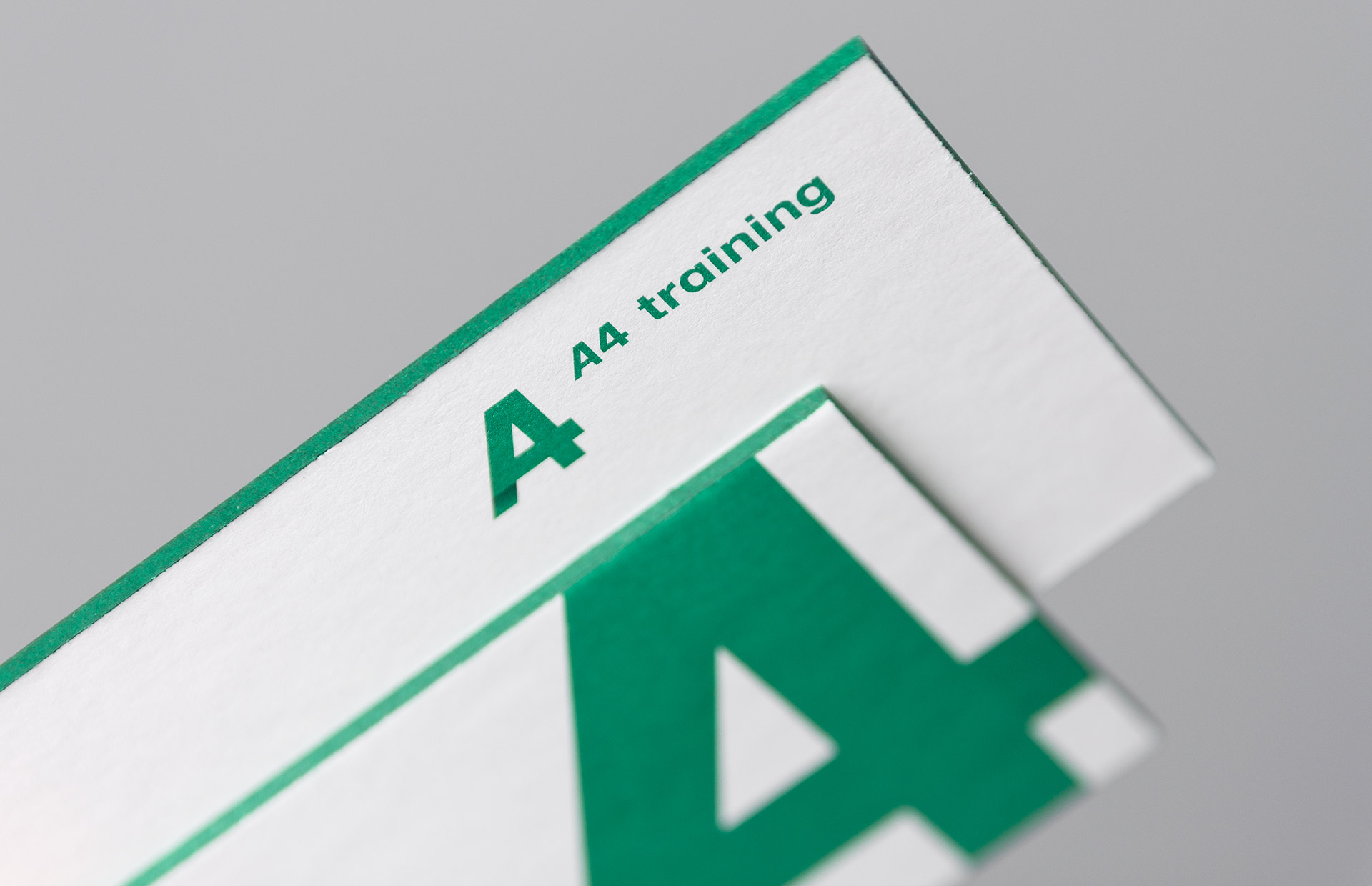
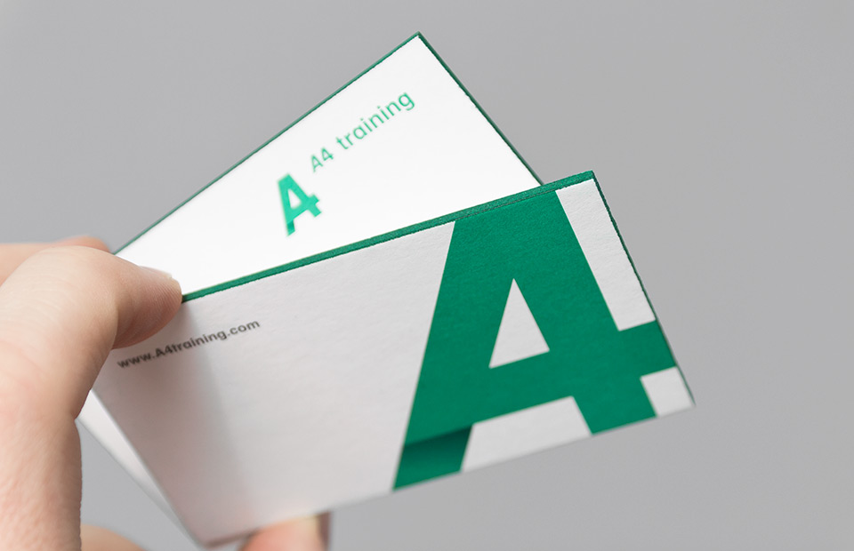
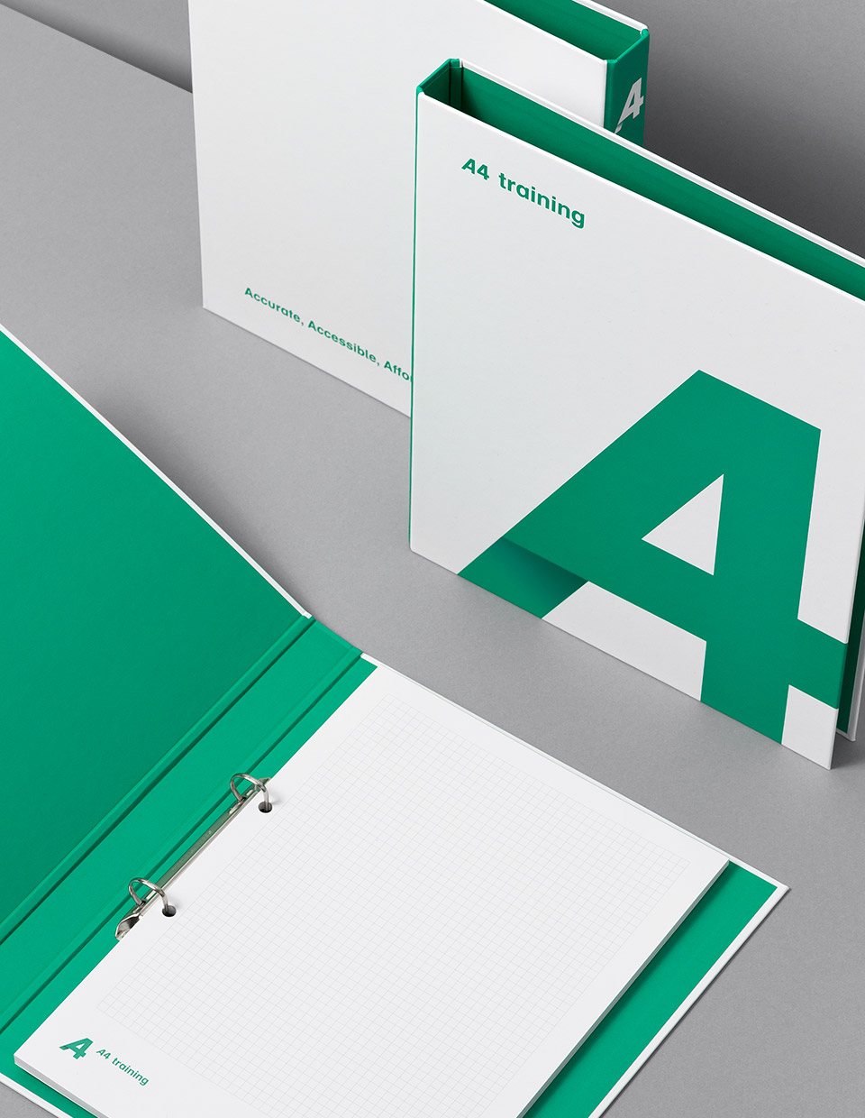
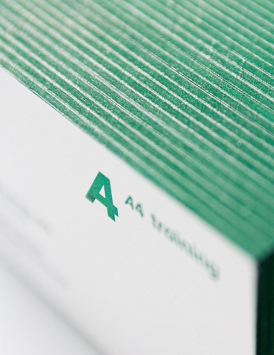
With its simple name, we wanted to create a strong and bold logo mark.
We designed a purely typographic, distinctive symbol which is a clear combination of the letter A and the digit 4. Together with a selection of green colour, it became a basic element of the entire brand identity.
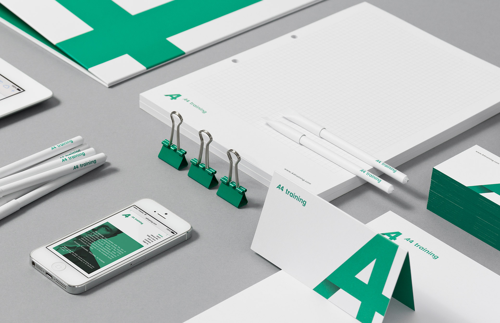
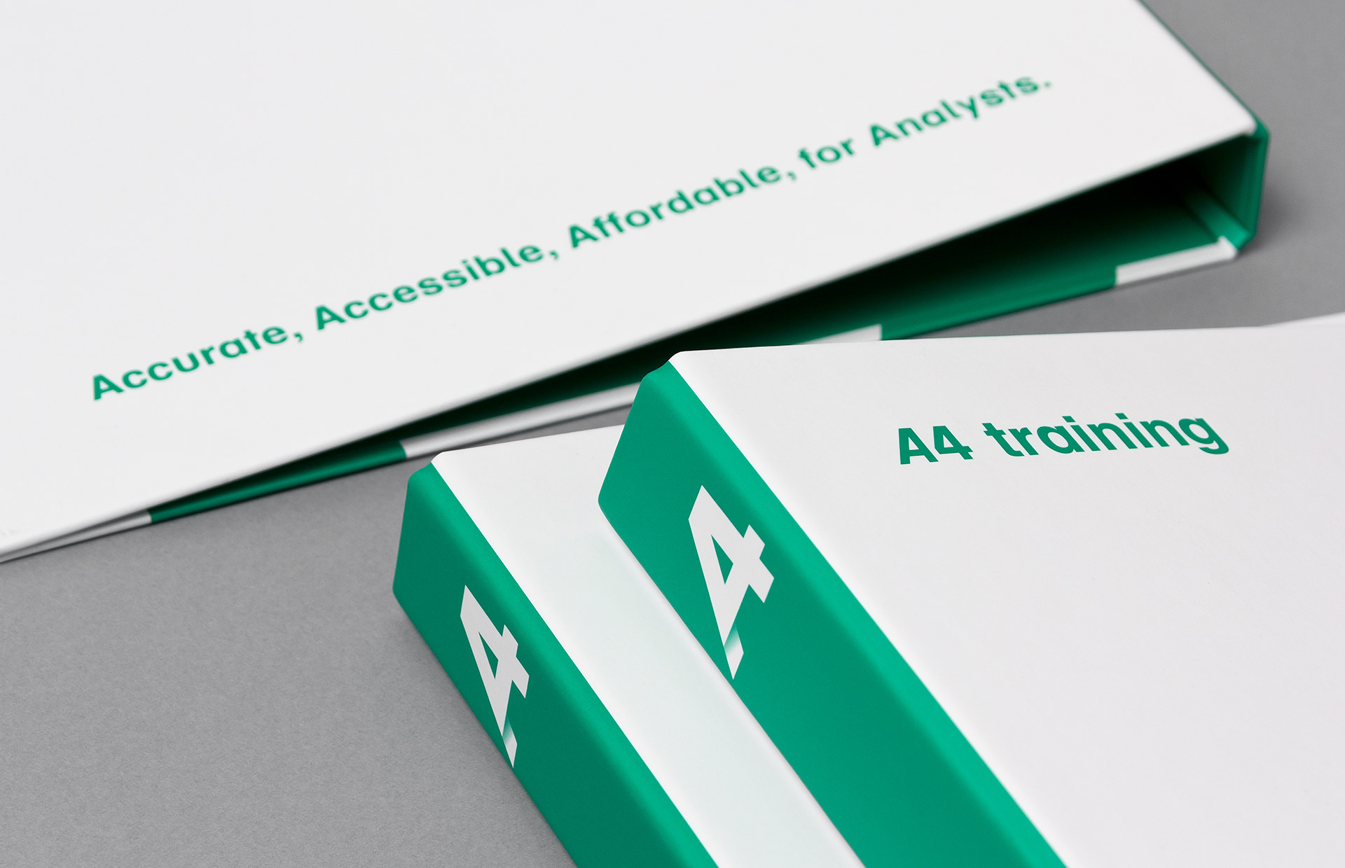
Due to the nature of business contacts, one of the most important elements of the new identity were business cards.
Almost 2mm thick paper, with green edge painting, did the job!
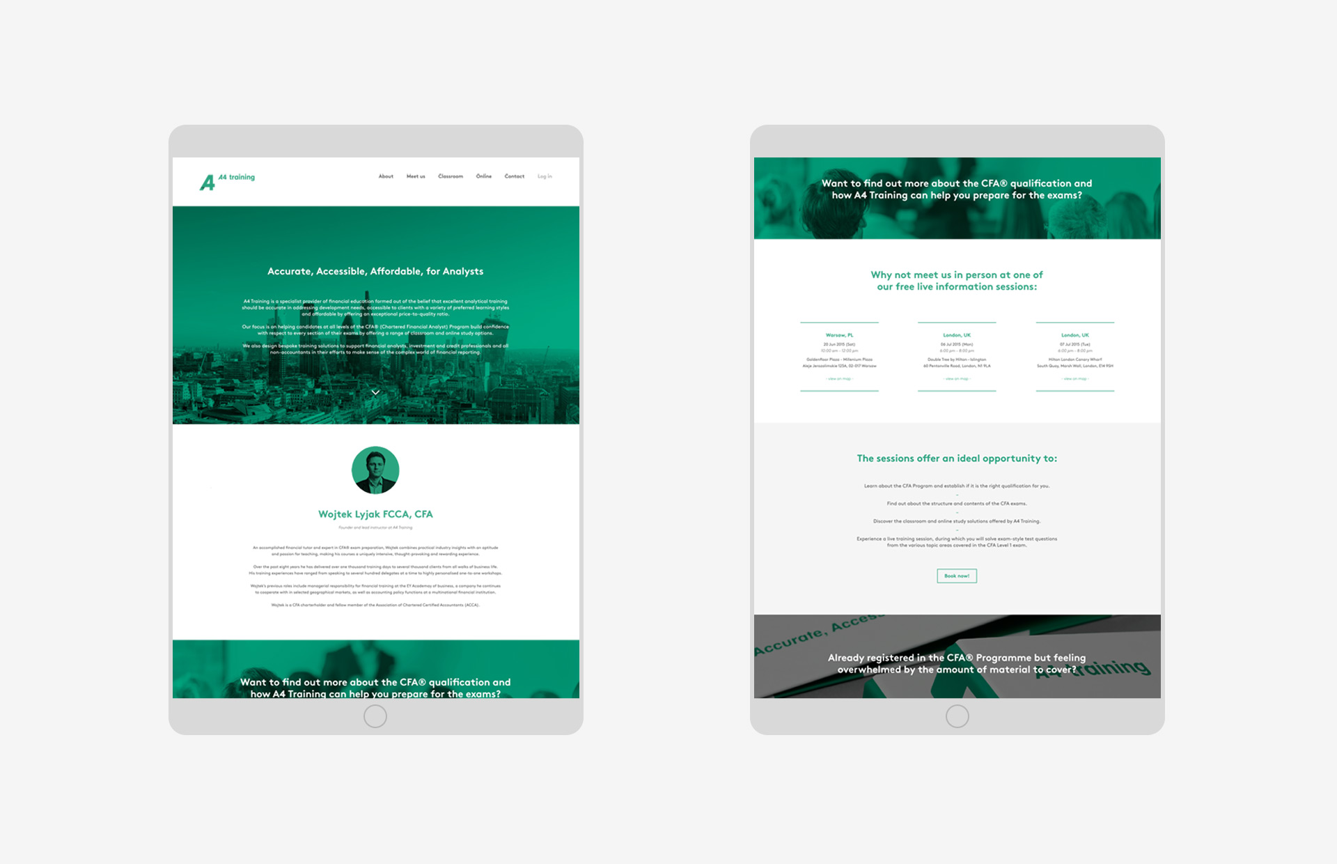
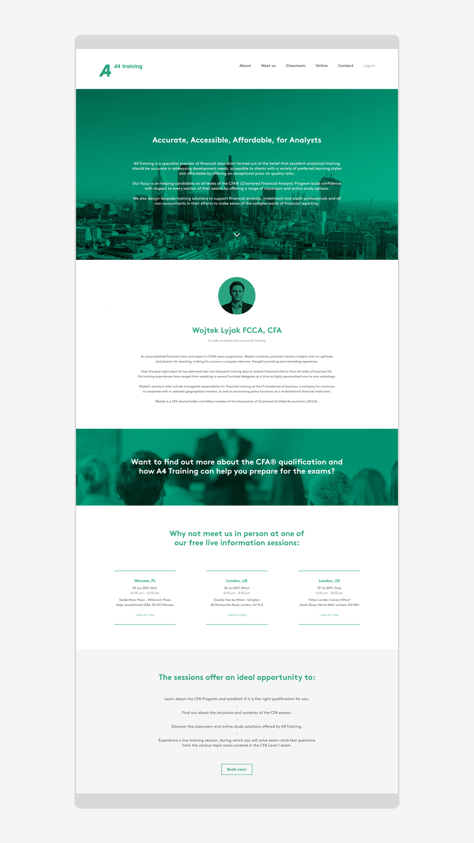
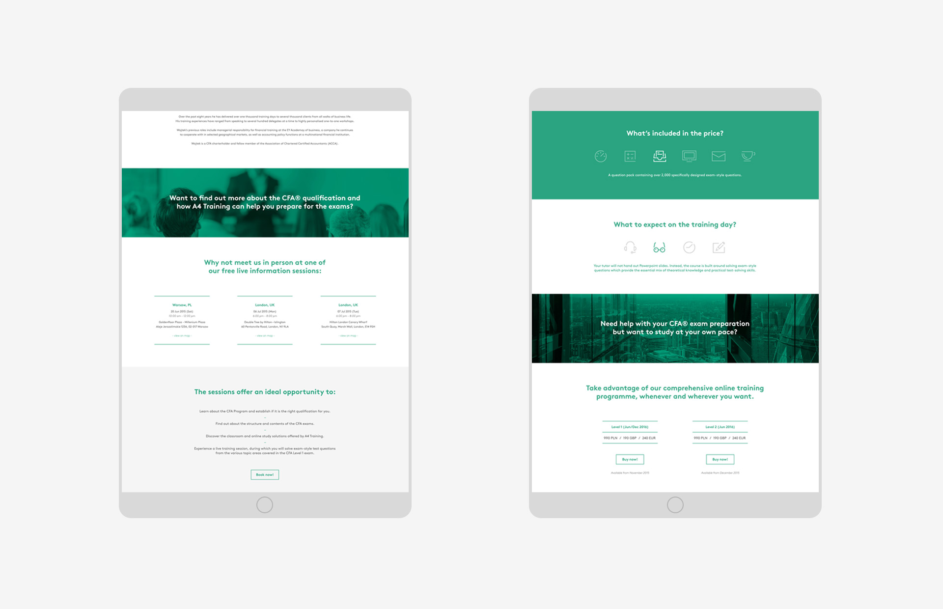
The last, but crucial element of the entire branding process was a web design.
We‘ve created the entire website together with the online video training platform available for signed users.