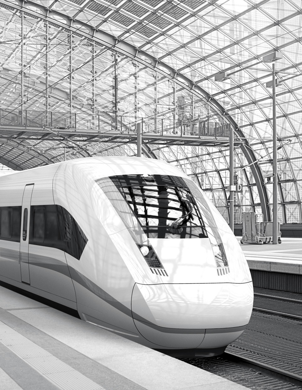
Over 40 years in business. What’s more: without a brand refreshment! But the day has come and Growag, the biggest Polish company in the rail industry, asked us to design their entire brand identity from scratch.
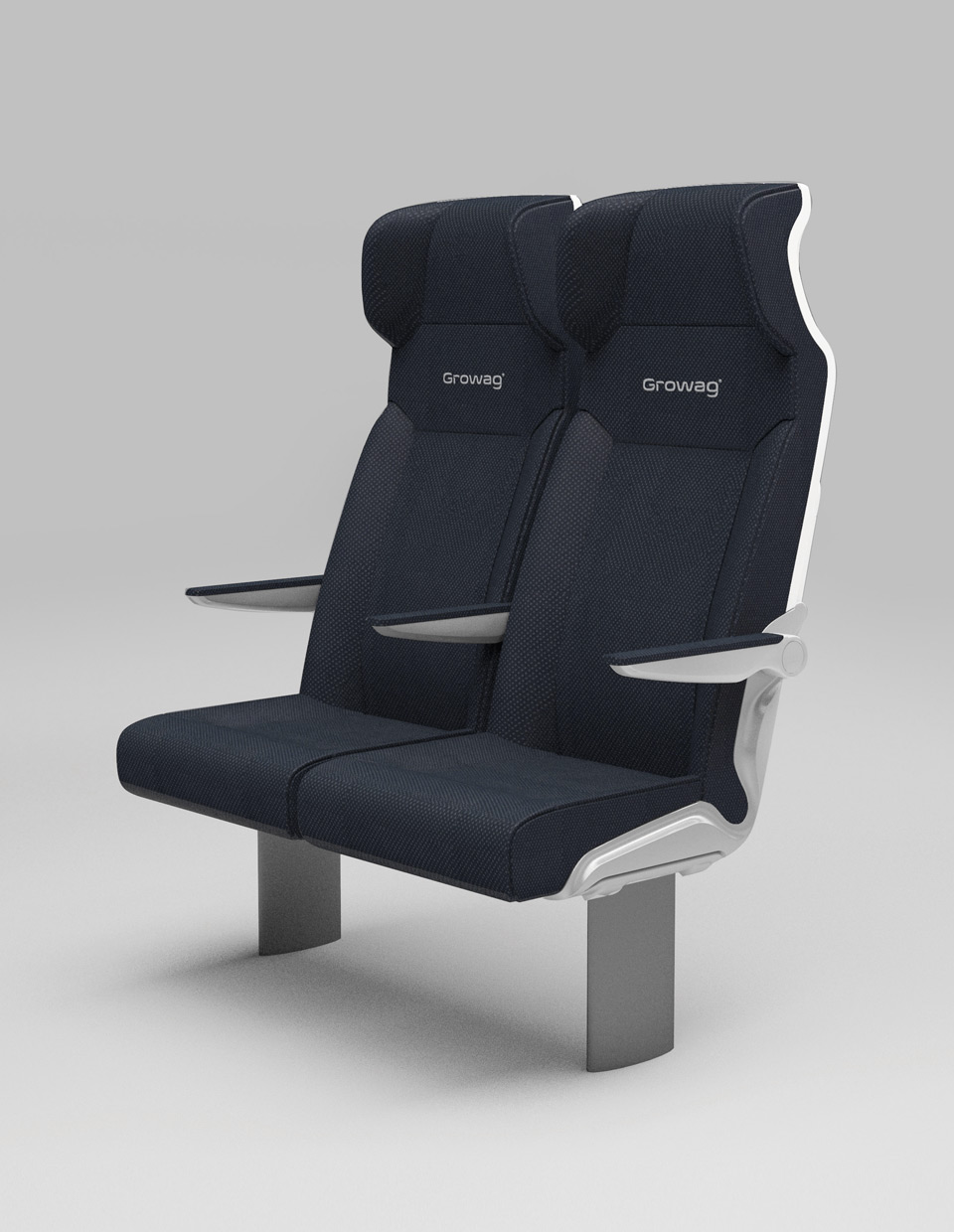
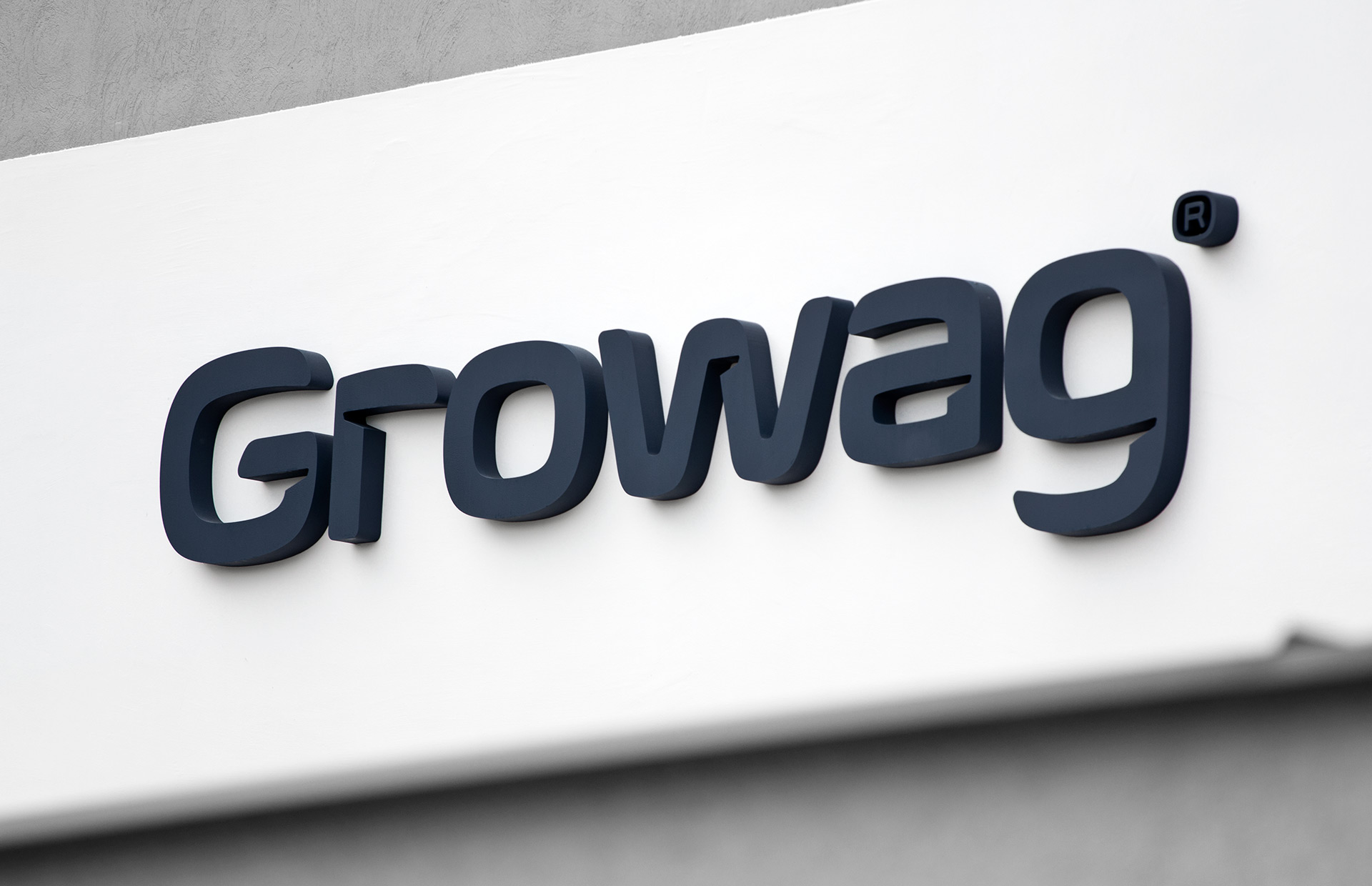
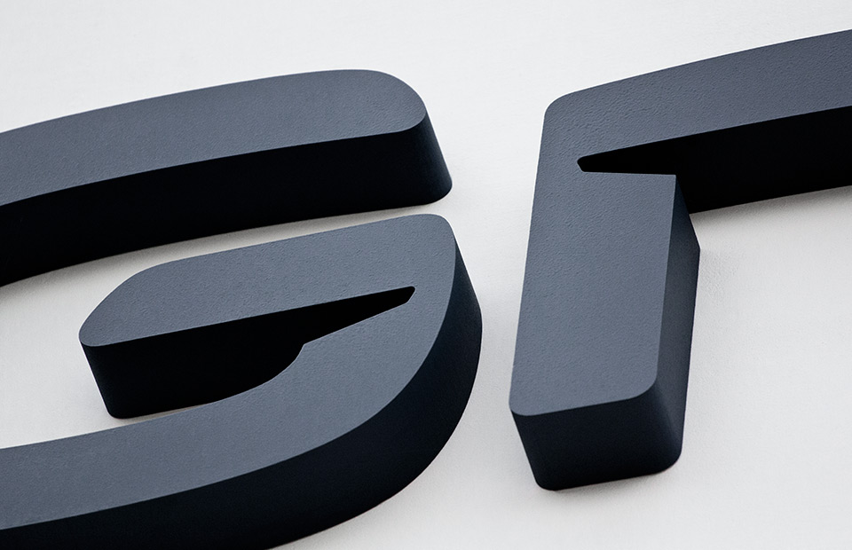
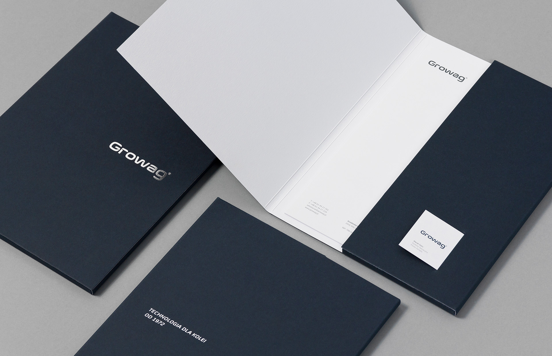
We‘ve developed a complete corporate identity starting from the design of a unique logotype. The characteristic details in letters relate to modernm dynamic trains and the seat components manufactured by Growag. The overall definite form of the logotype emphasizes long-standing tradition, commitment and experience behind the company’s success since 1972.
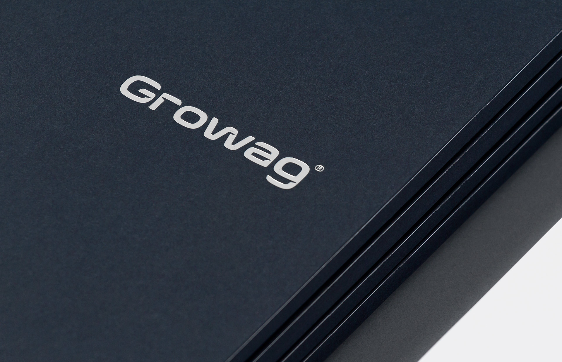
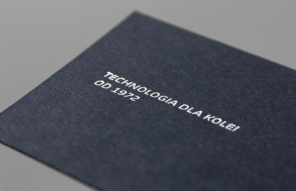
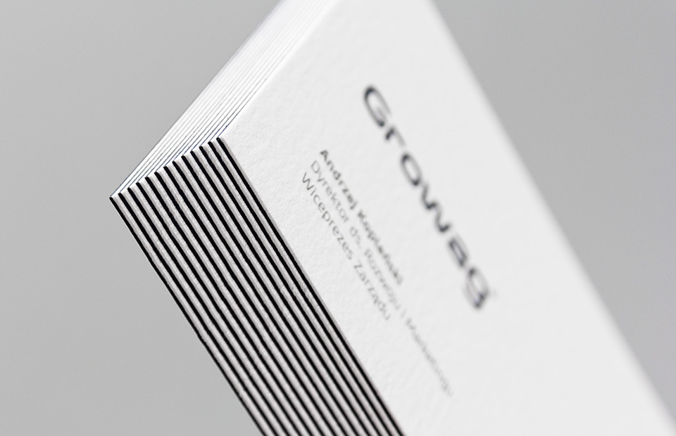
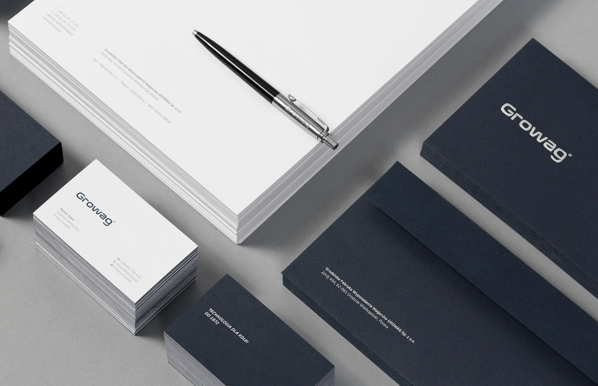
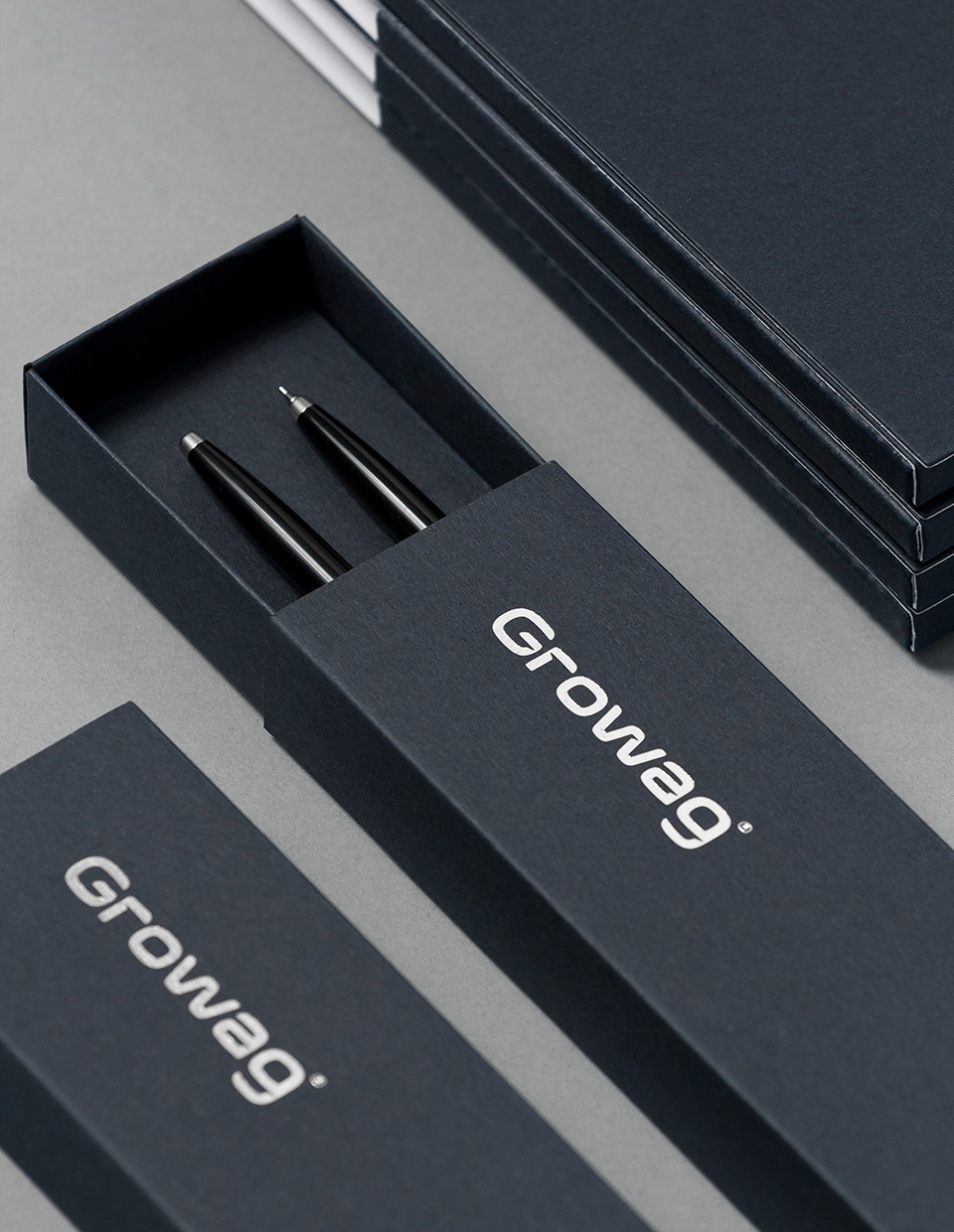
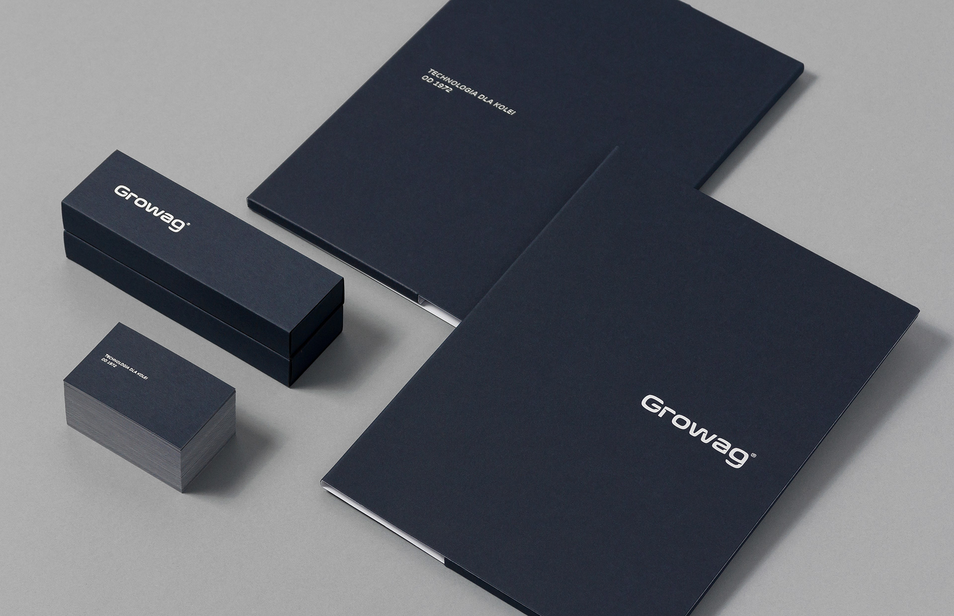
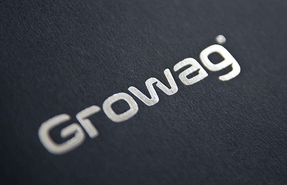
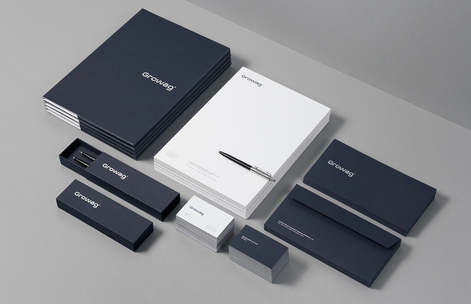
For corporate identity our choice was simple: a combination of quality paper stock with a silver hot stamp printing technique to accentuate the new logo.
White and navy blue paper had a well-balanced structure with the feeling between raw and prestigious.
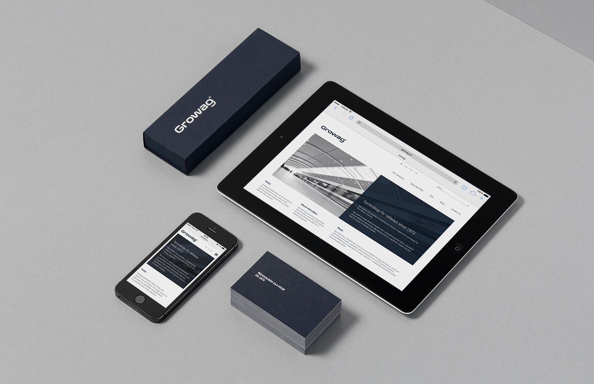
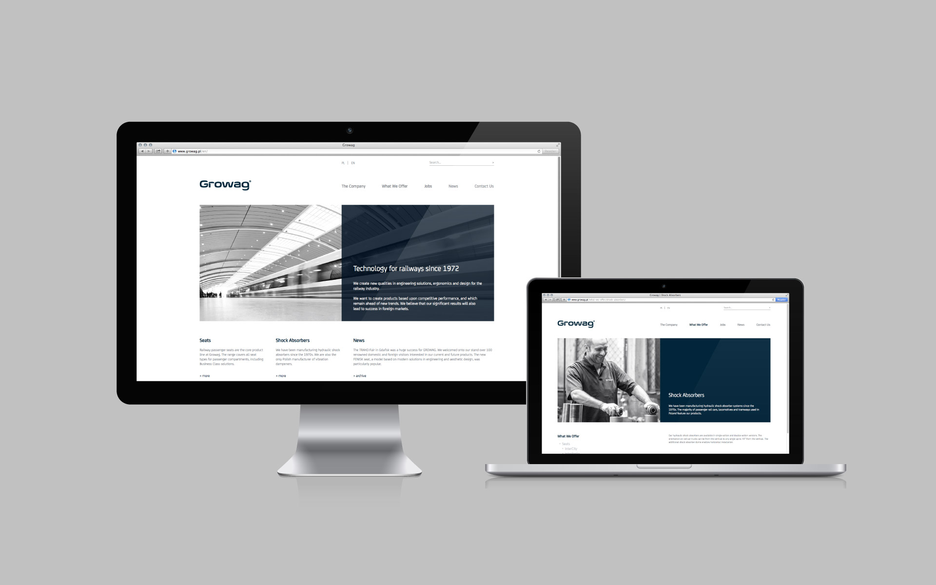
Apart from the aforementioned printed matter our role was also to design and develop the new website and a wide range of promotional materials.
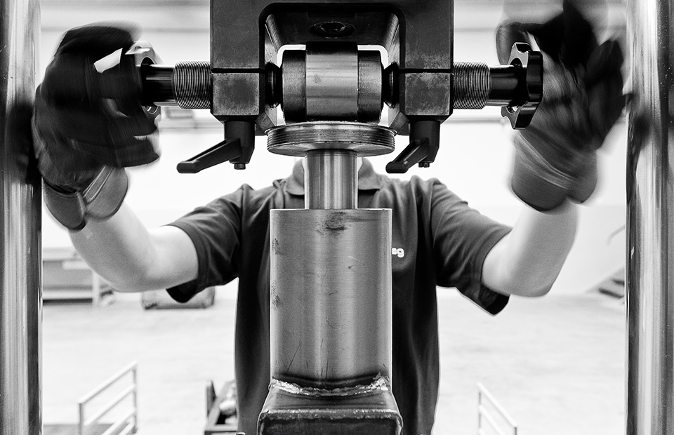
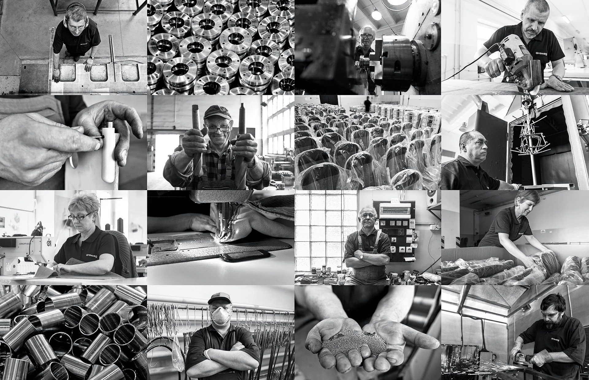
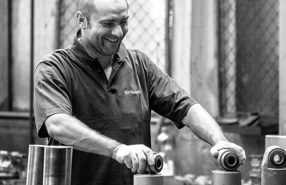
For that purpose, it was necessary to create a brand imagery base. The decision to move away from the stock images was easy. Real people, real ambience, real stuff.
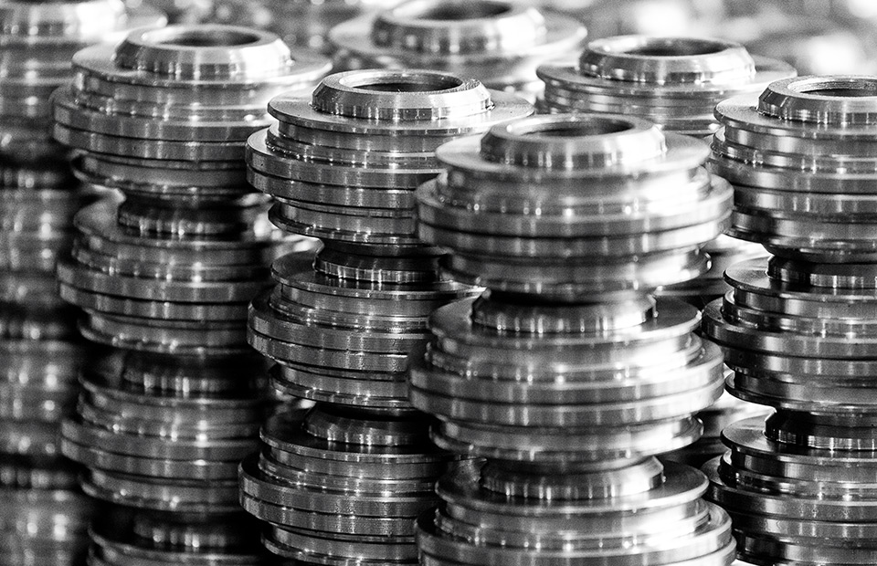
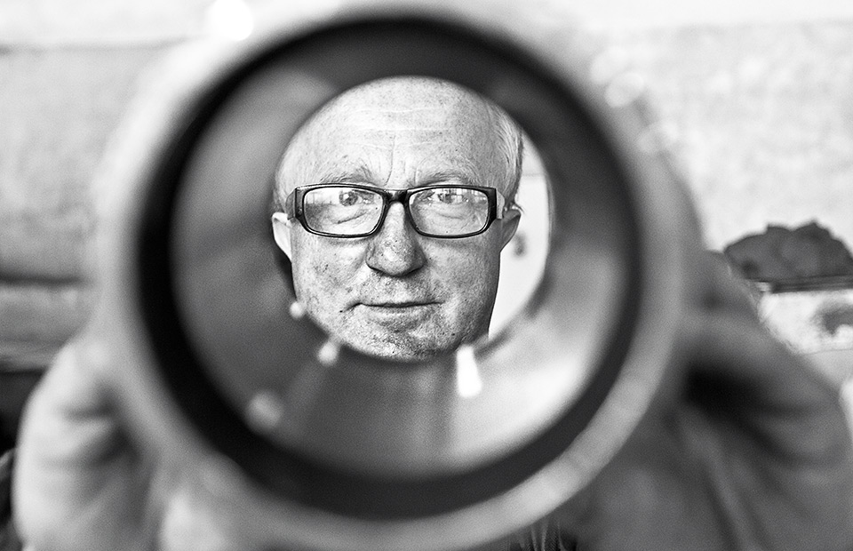
Together with Karol Wysmyk and his photojournalistic eye, we’ve tried to combine pure moments in the work of Growag employees, with production elements showing some finer details.
Black and white photographs were taken in industrial corridors of a factory where employees showed us their territory, along with objects and elements they were responsible for.
